Hovmöller diagrams excel at displaying data as a function of time and location.
The Hovmöller diagram was invented by Danish meteorologist Ernest Aabo Hovmöller (1912-2008). Typically, time is displayed on the ordinate (y-axis) and geolocation on the abscissa (x-axis). They are commonly used in meteorology and oceanography.
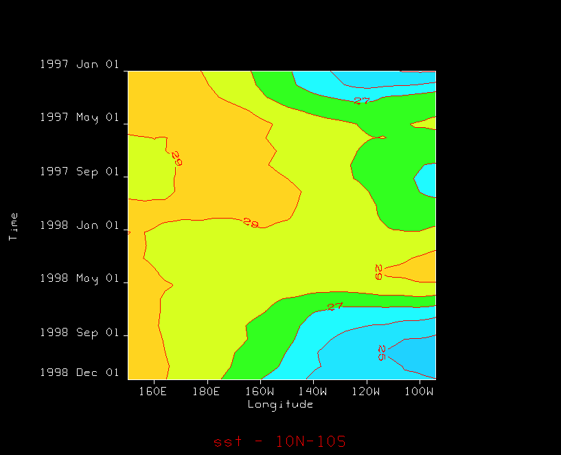
Let's create a Hovmöller of sea surface temperature (SST) from the Pacific Ocean to observe El Niño/La Niña-Southern Oscillation.
Data Choosers tree's URLs node, enter
the dods://www.esrl.noaa.gov/psd/thredds/dodsC/Datasets/noaa.ersst/sst.mnmean.nc URL and click
the Add Source button.Field Selector's Data Sources panel, right-click
the SST datasource and select Properties dialog.Times tab, select the Use Selected menu item and select a time range from January 1997 to December 1998 and click the Apply button. Spatial Subset tab and select a region in the equatorial Pacific Ocean from Mexico to Hawaii and click the OK button.Fields panel, select the Monthly Means of Sea Surface Temperature field.Displays panel, expand the Hovmoller tab
and select Time-Longitude (Contours) then click
the Create Display button.Change button. Choose a contour interval of 1 degree Celsius.default button. Change the range from 15 to 32.