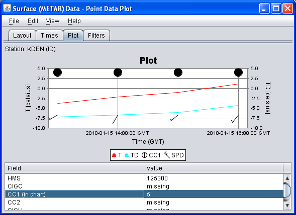
Select Fields button to show a dialog
that allows you to select what fields are displayed in the table.
Double click or right click on a table row to add it to the time
series chart.
See here for more information about customizing the chart.
The File->Save->Save Plot Preferences menu item allows you to save the current
set of selected fields and their chart line properties as the default
to use for all future point data plots.
The View->Show Raw Data menu controls whether
the data in the table is formatted or show as raw data.
The File->Export Table menu item allows you to export
the table as a comma separated value (CSV) file.
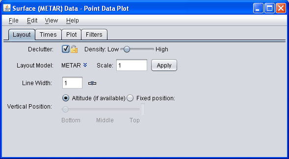
- Declutter
Click on the
Decluttercheckbox to see all locations or stations. The display otherwise shows only selected stations that do not overlap. When decluttering is turned on then, as you navigate through the display (e.g., through zooming) then the decluttering will be progressively applied. The small "lock" icon allows you to lock the stations that are currently being displayed and not have their display changed when navigating. - Plot Density
This slider allows you to change how dense the display of stations is when decluttering.
- Layout Model
The
Layout model, the choice of data and layout design for data display at each station, in use is named. Click onChangeto select other previously-defined station models, either provided by the IDV or defined by users.You can change the station model (plot layout), and create new station models, with the Layout Model Editor
- Scale
You can scale up or down the size of the displayed elements with this field.
- Vertical Position
You can choose to display the locations at their altitude (if there is one) or you can override this and specifically define the vertical position.
- Show (Time)
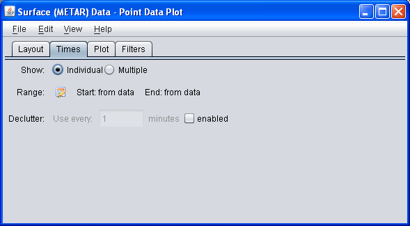
Select either individual times or multiple times.
- Range (Time)
Select the
 button to show the
dialog to change the start and end of the time range that is
used for displaying data:
This can be used with the individual or multiple times option. This dialog allows you to define the time range of the observations to show. The image above defines that the end time is the current animation time. The start time is relative to the end time less 30 minutes.
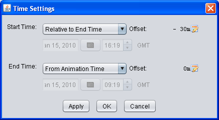
This time setting is similar to that used for the general time animation.
- Declutter (Time)
This field allows you to subset the data that is being displayed by only showing every N minutes. For normal observation data (e.g., station data) this field is not needed. However, for observation data that contains many times (e.g., airplane track data) you can use this field to subset the times.
Note: If you are displaying point data that has a large number of times you will be prompted whether you want to view all of the times. If Yes then this is automatically set.
For most of the point data sources you can specify a time binning through the data source properties.
- Filters
The Point Data Plot Control provides the ability to define a set of filters to show or hide particular observations based on the values they hold.
The above image shows the tab with which you define filters. This image shows two filter expressions, one that states the T field needs to be greater that 70 F, the other states that the SPD value needs to be greater than 10. The unit of the value you enter (e.g., F) is defined with: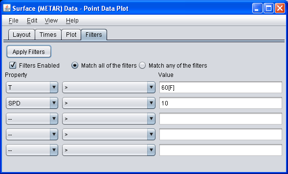
[unit_name]
If you do not provide a unit then the comparison is done using the native unit of the observation value.You can define any number of expressions, define whether they all should be matched or any should be matched, and disable and enable the filter.
You can also disable the filters and specify whether all filters need to match or any of the filters need to match.


