


The following are examples of some of the different kinds of displays available in the IDV. For more information how to manipulate the display, simply click the image to see the User Guide section for that particular display type. The general format of this section will be an image, followed by the steps needed to reproduce the image. However, before diving into creating different displays in the IDV, let's take a moment to discuss how to handle large data sets.
As you may have experienced, it can take quite some time to get the data into the IDV and render the displays. One way to speed this up is to spatially subset the data over an area of interest. For our case, the Gulf of Mexico is where the 'action' is, so let's subest for that particular region:
Reload your WRF output using the following steps:
Data Choosers tab in the Dashboard, locate your WRF output in the file browser and select the files you wish to load (hold shift to select multiple files)Data Source Type is set to Aggregate Grids by TimeAdd SourceField Selector panel, right-click your WRF output under Data Sources and click Properties.Spatial Subset tab and use your mouse to click-and-drag a rectangular box on the Bounding Box map display.OK.
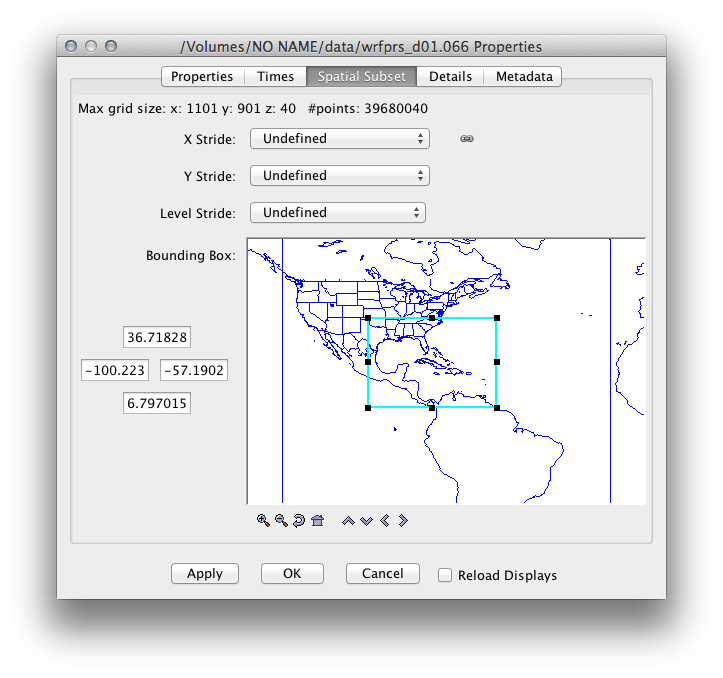
Note: Even with spatial subsetting in place, some displays (particularly the three dimensional ones) will take quite some time to render — consider using only one time step when producing these views.
Many of the example images used below take advantage of the NASA blue marble background image. If you wish to use blue marble, simply click Displays→Maps and Bounds→Add Background Image and select Blue Marble. A second way to add the blue marble background is to click the globe icon found just below the Main Menu Bar. Both of these methods can be used from either the Dashboard or the Main Window.
It may seem like we've done a lot of work to setup our environment (loading data, subsetting, adding a background, etc.). To aid in quickly restoring our environment, we will use the bundle feature of the IDV. A bundle is a way of saving the state of the IDV (current data sources, loaded maps, etc.). You can create a bundle that points to local or remote data (an .xidv), or you can create a bundle that actually contains the data (a .zidv), the latter of which is useful when sharing displays of data you've generated yourself, as it ensures your colleagues have the data needed to view the display. For our purposes, let's create a bundle that points to the WRF output on our memory stick:
File→Save As to bring up the Save dialog box.Views, Displays, and Data Sources are checked.File Format: is set to IDV Bundles (*.xidv), and name the bundle basicSetup.xidv.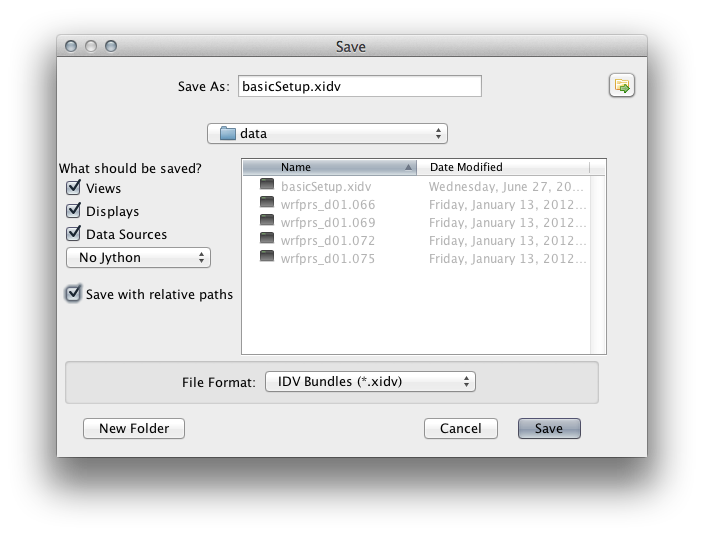
To test the bundle, click the scissors symbol, found just below the main menu bar, to clear out all of the data and displays. Then:
File→Open.Open bundle dialog box will appear — make sure Remove and displays & data and Try to add displays to current windows are checked and click OK.
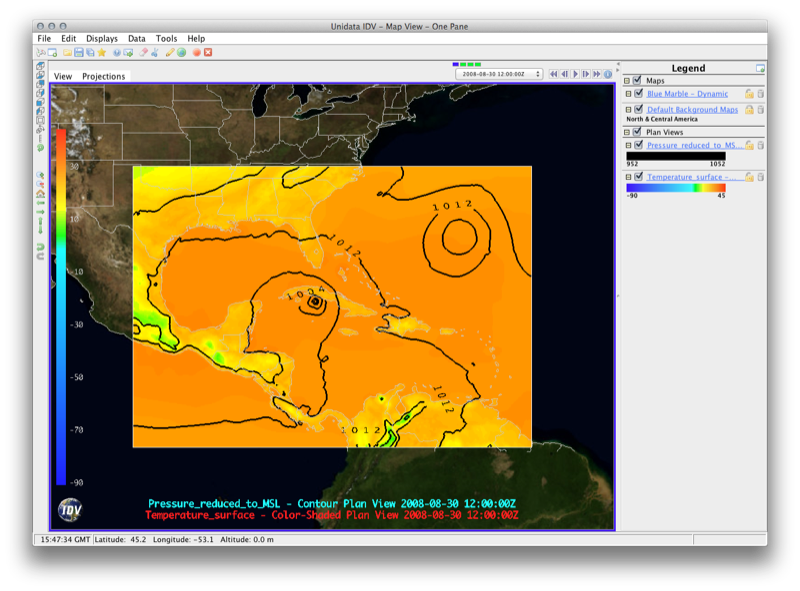
Field Selector panel,
expand the 2D grid tab. Select
Temperature @ Surface and the
Color-Shaded Plan View display, then click
the Create Display button. Displays panel, Select
Temperature @ Surface, and click
Edit→Properties, then select the Color Scale Tab
and check the box next to visible.
Other properties of the color scale can be accessed
from this tab, such as position and font properties. Click OK to apply
the changes.Field Selector panel,
expand the 2D grid tab, select
Pressure_reduced_to_MSL @ msl and the
Contour Plan View display, then click
the Create Display button. Displays panel, select the
Pressure_reduced_to_MSL field. Click the Change box next to Contour
to change the contour properties, such as base contour, interval, and label properties.Displays panel, change the contour color to black by clicking the box next to Color Table (likely labeled PressureMSL) and selecting Solid→Black.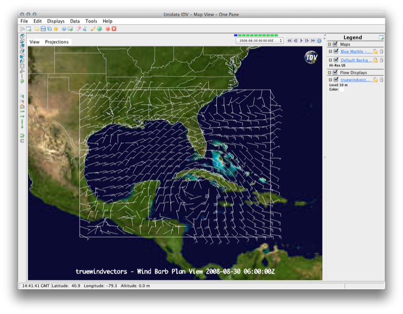
Field Selector panel,
expand the 2D grid tab. Scroll down and expand the
Derived tab. Select the
True Wind Vectors field and the
Wind Barb Plan View display, and then click
the Create Display button. The initial display of the wind barbs will be quite crowded, so we will need to clean things up a bit.
Displays panel, select
truewindvectors under View1, and set the Skip: XY: factor to 10.
Note that you can also change from a Wind Barb view to a Streamline view from
the display tabs by clicking the button next to Show: Streamlines. Also, if you
would rather see a vector plot (as opposed to a barb plot), simply select
Vector Plan View, rather than Wind Barb Plan View, from the Field Selector when
creating the display.
Field Selector panel,
expand the 2D grid tab. Select
Pressure Reduced to MSL @ msl
field and the Contour Plan View
display, and then click the
Create Display button. This will
allow us beter select an area of interest for
the trajectory display.Field Selector panel,
expand the 3D grid tab. Scroll down and expand the
Derived tab. Select the
Grid 3D Trajectory field and the
Trajectory Colored By Parameter display, and then click
the Create Display button. Field Selector box that appears,
expand the 2D grid tab. Find your WRF data
and expand this list. Scroll down and expand the
3D grid and select the
Specific humidity and then click
the OK button. Dashboard window will come to the front of your display and
show you the Trajectory Controls. Select 950 as the Level
(initial
level of the trajectories), select Rectangle for the Trajectory Initial Area, and set the Initial Area Skip Factor to 5. Dashboard and click the scissors icon. Dashboard window and click Create Trajectory. Displays panel, select Speficif_humidity_isob..
Click Edit→Properties, select the Color Scale Tab
and check the box next to visible. Click OK to apply
the changes.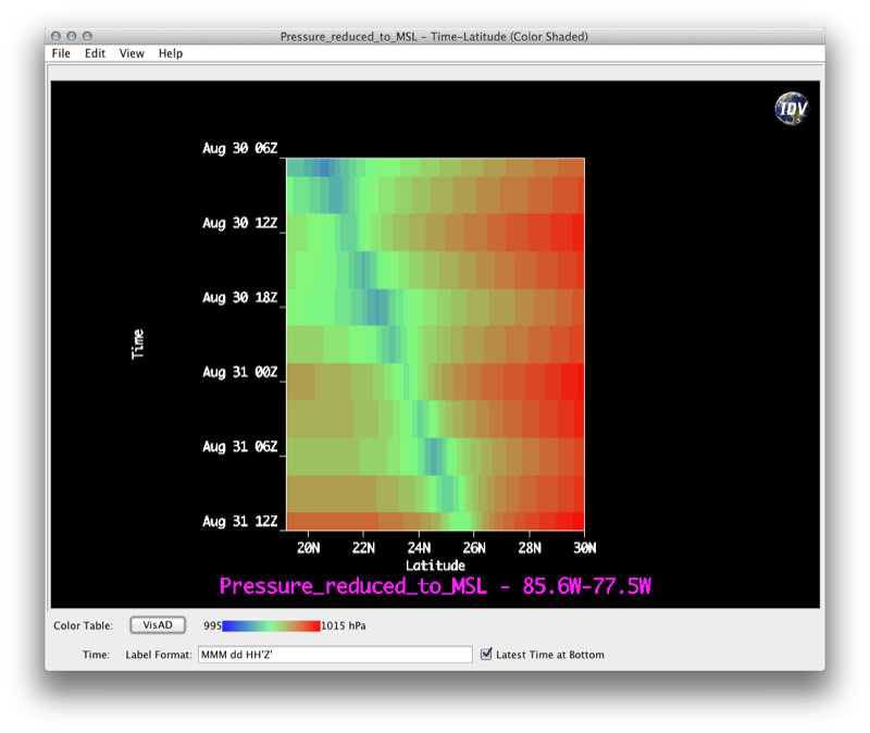
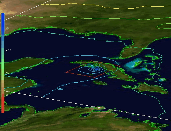
Field Selector panel,
expand the 2D grid tab. Select
Pressure Reduced to MSL @ msl.In order to clearly see the Hurricane path, we will subset the dataset before we create the Hovmöller diagram.
Pressure Reduced to MSL @ msl, click
the Region tab located in the bottom right panel, uncheck Use Default
and select the region of interest by using your mouse to click and drag a rectangular selection on the map.Hovmoller→Time-Latitude (Color Shaded) display,
then click the Create Display button.Displays panel, select the view for the Hovmöller
diagram. Then, from inside the Displays tab, click View→Undock from Dashboard to view the diagram
in its own window.
The Time-Latitude Hovmöller display shows Pressure Reduced to Mean Sea-Level as a
function of time and latitude. Because we chose Time-Latitude (Color Shaded), mean sea-level pressure will be
averaged over longitude for each time-step. To average over latitude instead, recreate the display using Time-Longitude (Color Shaded) display.
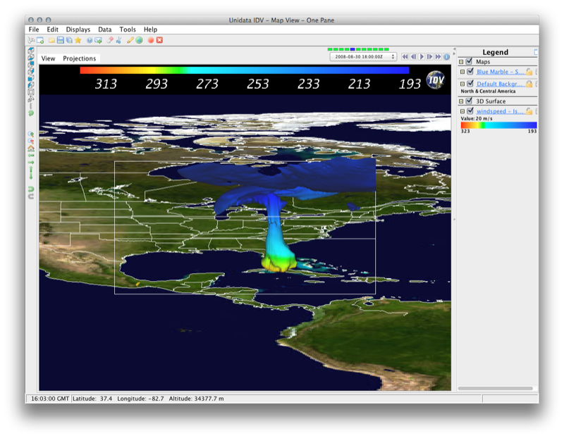
Field Selector panel,
expand the 3D grid tab. Scroll down and expand the
Derived tab. Select the
Speed (from u_wind & v_wind) field and the
3D Surface→Isosurface Colored by another parameter display,
and then click the Create Display button.3D grid→Temperature @ isobaric.Displays panel, set the Isosuface value to 20 m/s.Edit Color Table. This will bring up the color table editor.Invert Color Table, and then click OK to exit the editor.Displays panel, Select
windspeed - Isosurface, click Edit→Properties,
then select the Color Scale Tab and check the box
next to visible.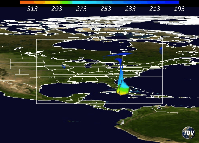
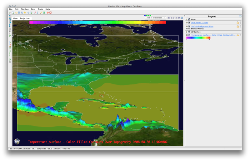
Field Selector panel,
expand the 2D grid tab and select the
Temperature @ surface field and the
3D Surface→Color-Filled Contoured Parameter Over Topography display.Field Selector dialog box will appear and ask you to select the Topography field. From your WRF output, select the 2D grid tab and select the
Geopotential_height @ surface field and click OK.Basic→Bright38.Change Range...Use Predefined box,
select From All Data, and then click OK.Displays panel, select Temperature_surface -....
Click Edit→Properties, select the Color Scale Tab
and check the box next to visible. Click OK to apply
the changes.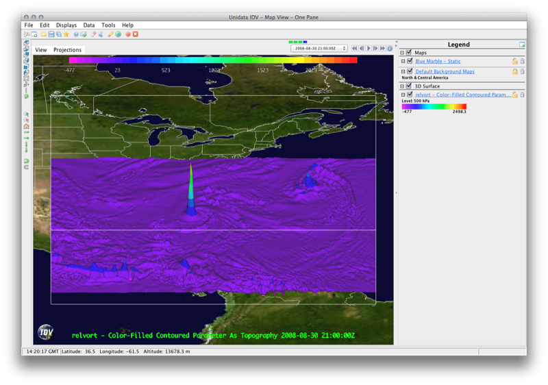
Field Selector panel,
expand the 3D grid tab. Scroll down and expand the
Derived tab. Select the
Relative Vorticity (from u_wind & v_wind) field and the
3D Surface→Color-Filled Contoured Parameter as Topography display.Create Display button.Basic→Bright38.Change Range...Use Predefined box,
select From All Data, and then click OK.Displays panel, select relvort - Color-Filled....
Click Edit→Properties, select the Color Scale Tab
and check the box next to visible. Click OK to apply
the changes.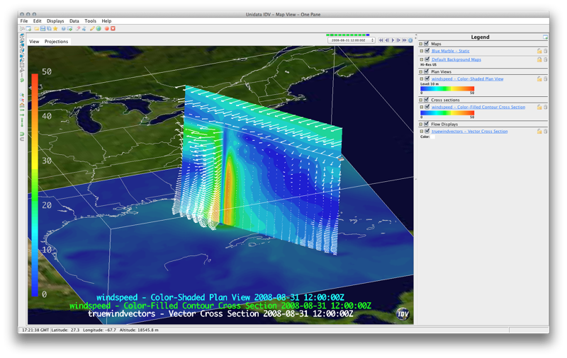
The image above is created from velocity data. A 2D color shaded plan view of speed at 2 m AGL is displayed along with two cross sections — one of wind speed and the other of horizontal wind vectors. Both cross sections are set to coincide, though this is not the default behavior. To produce the cross sections shown above, do the following:
Field Selector panel,
expand the 2D grid tab. Scroll down and expand the
Derived tab. Select the
Speed (from u_wind & v_wind) field and the
Cross sections→Color-Shaded Plan View display,
and then click the Create Display button.Field Selector panel,
expand the 3D grid tab. Scroll down and expand the
Derived tab. Select the
Speed (from u_wind & v_wind) field and the
Cross sections→Color-Filled Contour Cross Section display,
and then click the Create Display button.Field Selector panel,
expand the 3D grid tab. Scroll down and expand the
Derived tab. Select the
True Wind Vectors (from u_wind & v_wind) field and the
Flow Displays→Vector Cross Section,
and then click the Create Display button.Notice that at this point, each cross section has its own control in the view window. To link the cross sections such that they coincide, do the following:
Display panel,
select windspeed - Color-Filled Contour Cross Section,
then click Edit→Sharing→Sharing on.truewindvectors - Vector Cross Section display.Now that the two cross sections are linked, let's clean up the vector plot as it's pretty cluttered:
Displays panel, select
truewindvectors under View1, and click the Settings tab.Edit→Properties, select the Spatial Subset tab in the Properties box that appears, and set X Stride: and Y Stride: to Every twentieth point.As a final step, make sure the color scale used in both speed displays (plan view and cross section) have the same range, and display one of the scales. For each color scale in the legend (right panel in the Main View Window):
Change Range...Use Predefined box,
select From All Data, and then click OK.Then, add the color scale to the display:
Displays panel, select either
windspeed - listed under View1, and set the Settings tab.Edit→Properties, select the Color Scale Tab
and check the box next to visible. Click OK to apply
the changes.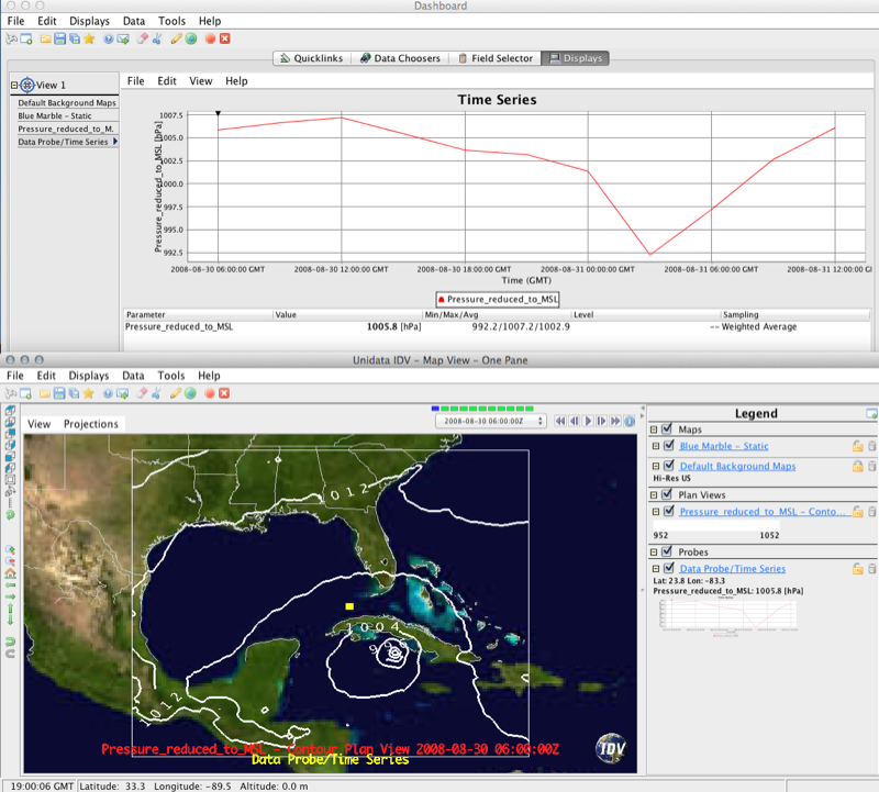
Field Selector panel,
expand the 2D grid tab and select the
Pressure_Reduced_to_MSL @ msl field. Then, hold
control (or Command, if on a Mac) and select the
Plan Views→Contour Plan View and Data Probe/Time Series
displays, and then click the Create Display button.
In the Main View Window, you will see contours of Pressure_Reduced_to_MSL @ msl, as well as a Probe marker (in the example above, the marker is a yellow rectangle located just NW of Cuba). You can click and drag the probe marker to move it to a location of your choice. The corresponding time series plot will show up in the Dashboard under the Display tab (shown above the Main View Window in our example image). Note that the Data Probe will also work with three-dimensional data, and you will be able to move it vertically as well.
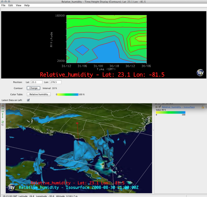
Field Selector panel,
expand the 3D grid tab, and select the
Relative Humidity @ isobaric field. Then, hold
control (or Command, if on a Mac) and select the
3D Surface→Isosurface and Probes→Time/Height Display (Contours) displays, and then click the
Create Display button.Display panel,
select Relative_humidity - Isosurface,
and set the isosurface value to 90%.In the Main View Window, you will see the 90% RH isosurface, as well as a time-height marker (in the example above, the marker is red vertical line with a rectangle on top). You can click and drag the probe to move it to a location of your choice.
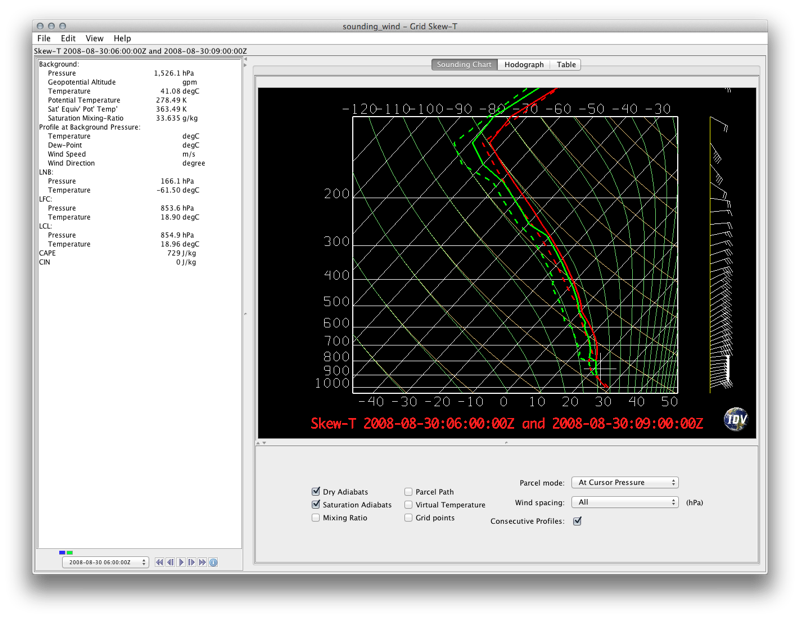
Field Selector panel,
expand the 3D grid tab. Scroll down and expand the
Derived tab. Select the
Sounding Data (with true winds) field and the
Soundings ->
Grid Skew-T.Times tab. Select Use Selected from the drop-down
box and select the first three time steps (hold control or command to select
multiple times),then click the Create Display button.Region tab and click-and-drag a rectangular region around Cuba - we're subsetting spatially to focus on the hurricane.Pressure_reduced_to_MSL @ msl to
more easily navigate the skew-T location marker through the dataset (similar
to the time-height marker from the previous example).Displays tab. Undock the display
(View→Undock from Dashboard).
A feature of the skew-T display is that you can animate skew-T's in time. However, sometimes it is nice to see consecutive skew-T's (data from two different times) on the same chart. Underneath the Skew-T diagram are the display controls, which includes the ability to see Consecutive Profiles (simply check the box next to Consecutive Profiles to enable this feature). To update the sounding parameters, use the middle click on your mouse to set the location of the originating parcel. If you are using a Mac Trackpad, you will need to select a point on the skew-T diagram with Command+Click, then use Option+Click to update the parameters.